Georgia (and Machine Learning) on my mind
Harnessing data for better bridges
An inspector at work. Photo by Amogh Manjunath on Unsplash
Problem
Recently, the American Society of Civil Engineers scored the overall health of America’s infrastructure as a D+. Our infrastructure is old. A major facet of this decaying group of assets is bridges. Understanding and managing the condition of these structures is crucial to the continuing goals of the Georgia Department of Transportation (GDOT). To aid these goals, our analysis will build predictive models to see when a bridge is in danger of needing repair or replacement. Our goal is to predict two measures of bridge condition, condition rating and sufficiency rating, before the inspection occurs, using already available data.
GDOT (and other DOT’s) will benefit from the analysis in multiple ways.
- A predictive model will allow early detection of problems.
- It will allow more efficient allocation of bridge inspector resources and may increase the success of the entire bridge inspection pipeline.
- Finally, the predictive model will provide for a safer infrastructure network, as we are now using untapped data to ensure the health and safety of the public.
Datasets
The majority of our data comes from the freely available Bridge Inventory provided by the Federal Highway Administrations National Bridge Inventory (NBI) here. The data does not include elevation data, which we wanted to include as a feature, so we used the Open Elevation API from MapQuest to access this dataset and combine it with the NBI data.
Analysis
Data science is not a black box, and the best way to avoid it becoming one is to know your data really well. So we begin with Exploratory Data Analysis. First, let’s take a look at the distribution of bridge lengths in the state of Georgia.
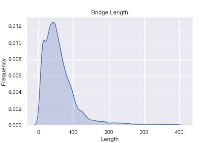
It’s interesting to see that most bridges in Georgia are less than 100 ft long and I bet that goes against your intuition. A takeaway is that not all bridges are like the ones you see crossing the interstate.
What else do we want to know about bridges? We can take a look at the distribution of years that these bridges were built to get an idea of their age distribution.
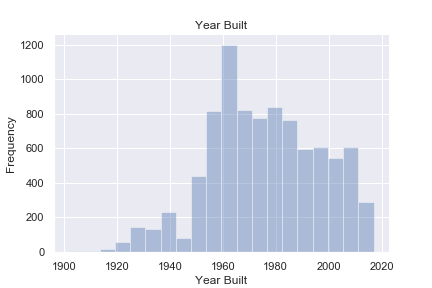
We can see that a spike of construction happened in the late 1950’s, early 1960’s. Cool enough, this corresponds to an actual historical event, the passing of the Federal-Aid Highway Act by Dwight Eisenhower. This act created what is now the interstate system in America. Link here. This is also another reason why our infrastructure in America, and more specifically in Georgia is in great need of repair. A lot of them belong to the Baby Boomer generation.
Let’s take a look at the distribution of bridges geographically in the state.
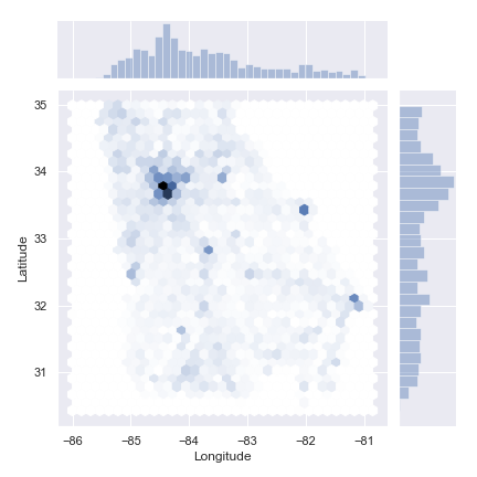
Atlanta dominates
Pretty neat, but this one jives with what we expect. Most of the bridges are located around the major metropolitan centers such as Atlanta, Augusta, Savannah, and Macon. Oh, and that blank spot at the bottom? That’s Okefenokee Swamp. Also note the distribution bars at the top and right.
Let’s also take a look at the distribution of condition ratings and sufficiency ratings, our variables we are trying to predict. Condition Rating is a discrete score from 0 to 9 that is given to each of three locations on a bridge, the Deck, Superstructure, and the Substructure. Think Deck as what a car drives on, Superstructure as mainly the beams that hold the deck up, and Substructure as the piers/columns/abutments that everything else sits on. Sufficiency rating on the other hand is a continuous score from 0 to 100 that is based heavily on condition rating, but also on other geometrical factors. We can see that all three have very similar distributions, and the superstructure seems to be in the best shape relatively.

Machine Learning
In order to predict the bridge ratings, we have to prepare the data to be used in the machine learning models. This is called Preprocessing. Most of the time you do not simply dump the data into a black box model and hope for the best. In our case, the features that were selected are the following
Features: Latitude, Longitude, Elevation, Age, Structure Length, Design Load, Roadway Width, Annual Daily Traffic (ADT), Percent Trucks, Degrees Skew, Horizontal Clearance
These features are selected mainly through domain knowledge and are not generated artificially from the dataset. They all represent fairly accessible information about a bridge that an engineer could get access to.
All of the features are on different scales, and many have outliers, such as we saw in the Bridge Length plot above. These outliers, and the relative scale of the feature, could have oversized effects on the model produced from the data. Since this is not desirable, we use the QuantileTransformer from sklearn.preprocessing to prepare the data.
Machine Learning Pipeline
For most models in this analysis, a pipeline was constructed with a transformer and GridSearch over hyperparameters. The models were fitted to the data using nested cross validation and evaluated on a hold out set. Here is sample code for the Ridge Regression model.
Model Performance
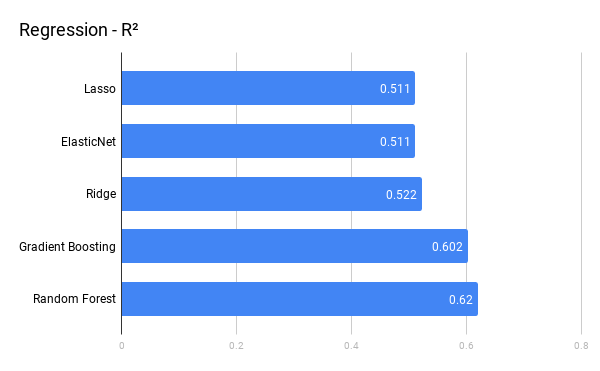
The model results after all steps were performed is shown below.
Regression models
Classification Models
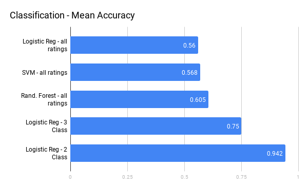
Overall we can see that the classification models outperform the regression models. This is mainly due to the Design Load feature. Design Load as used in our model is not truly a continuous variable, but does include new information for the model, therefore a classifier is better able to use the information than regression. The Logistic Regression binary classifier has an advantage over all the other models, which is discussed later.
Model Evaluation
One of the best ways to evaluate a classifier model is to develop a confusion matrix. For all confusion matrices predicting any arbitrary number of n classes, an n x n matrix is developed in which the diagonals represent true predictions and any value off diagonal is an error in prediction. In the case of binary classification (is something, is not something), then the values off the diagonal of the matrix represent false positives and false negatives. The confusion matrix for the Random Forest classifier is a good example of the output, shown below.
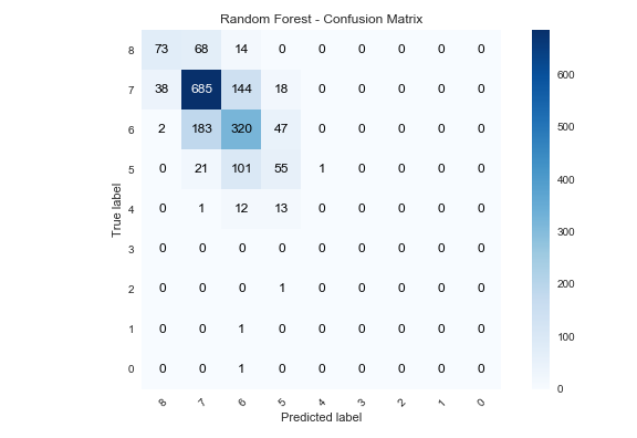
Random Forest, non-random results
Best Performing Model
We notice that the Logistic Regression model — 2 class outperforms all models, but why is it head and shoulders above the rest? There are multiple reasons. One reason is that we mapped the 10 different condition rating values to 2, Poor/Good. If any of the the three locations have a condition rating of 4 or less, then the bridge is rated as Poor. In general, as you reduce the number of classes, the model will perform better and we have shown this to hold true in our case.
However, the results are not as rosy as they seem. Our 2 class model suffers from a high class imbalance. Referring back to the plots of condition rating above, we can see that when we re-aggregate our target variable into two classes, most of them will be in the class “Good” which means that the condition rating does not represent a deficient rating. Hence, the high accuracy of the logistic regression model is over inflated simply because most values do not belong to the “Poor” class. Metrics such as Precision and Recall will give a more accurate estimate of model performance than accuracy in this case.
Conclusion
With this analysis, we have shown that we can meaningfully predict the outcomes of bridge sufficiency ratings and bridge condition ratings in the state of Georgia using easily obtainable data from the FHWA. These models can be deployed to aid the DOT in their asset management business and will provide significant value to the department and the taxpayers.
This article only scratches the surface of the full analysis. Check out the full notebook and supporting code on Github here


